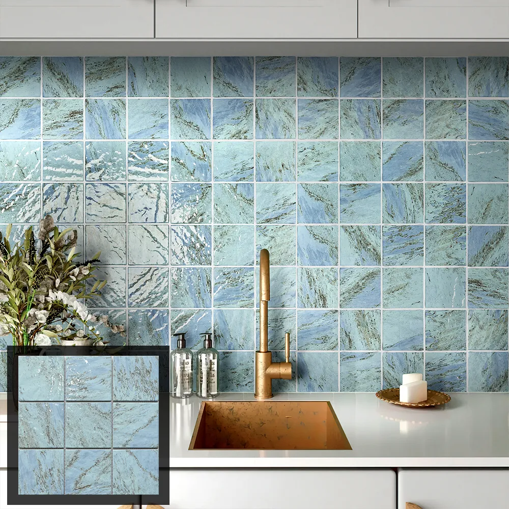
A kitchen backsplash connects several visual elements, including countertops, cabinets, wall colors, fixtures, and lighting. Mosaic tiles come in different materials, shapes, finishes, and colors, all of which influence the overall look. Start with the finishes that are already fixed, then build a palette around them.
This order helps prevent a common design problem: choosing a tile sample in isolation and discovering later that it competes with the countertop or cabinet finish. A small sample board can make the relationships easier to judge before products are selected.
Start With the Fixed Finishes
Identify the materials that are least likely to change. In many kitchens, these include cabinetry, countertops, flooring, and major appliances. Note their dominant colors and whether their surfaces have visible movement, grain, or pattern. The backsplash can then complement those features without trying to repeat every detail.
Build a balanced palette
A palette often works best when it has a clear lead color and a limited number of supporting tones. A neutral countertop, for example, leaves room for a more expressive mosaic, while a patterned stone surface may call for quieter tile colors. These are design directions rather than fixed rules; the actual sample combination matters more than a label like “warm” or “cool.”
Look at undertones side by side. A white tile can appear warmer or cooler next to cabinetry, and a gray mosaic may shift beside wood or metallic finishes. Gather physical samples of the materials that will remain, then compare them under the room’s daylight and planned artificial lighting.
Choose a role for the backsplash
When comparing mosaic tiles for backsplash kitchen, decide whether the backsplash should blend with surrounding finishes or become a focal point. A restrained palette can create a continuous look across the counter area. When selecting a design, buyers should consider how the mosaic’s color, shape, and pattern relate to the surrounding finishes. A contrast in color, shape, or pattern can draw attention to the cooking zone or another selected section.
For a focused accent, keep the rest of the palette controlled. If cabinets, counters, and hardware already have strong visual character, a complex mosaic may add too much activity. Conversely, a simple room can accommodate a more noticeable pattern when the colors relate to the existing finishes.
Match Pattern Scale to the Wall
Mosaic patterns contain repeated units, but their appearance changes with viewing distance and installation area. A design that feels detailed in a small sample can read as a texture across a full backsplash. Review a larger sample layout or digital elevation to understand how repetition will look between counter and cabinets. This is particularly useful when comparing mosaic tiles for backsplash kitchen designs, as the pattern may look different across a full wall than it does on a small sample.
Compare geometric and tonal effects
Geometric arrangements create a visible rhythm, while blends of related shades can read as a softer field. Before choosing, consider whether the pattern should align with cabinet doors, shelves, or the kitchen’s overall geometry. Sample the full repeat where possible, because a single sheet or small swatch may not show how the design connects across a wall.
Color contrast also affects pattern visibility. Similar tones can make the mosaic feel more unified, while stronger contrast emphasizes individual pieces and grout lines. Neither effect is automatically preferable. Choose according to how prominent the backsplash should be from the main viewpoints in the room.
Check boundaries and interruptions
Plan how the mosaic meets outlets, windows, range hoods, shelves, and end panels. These interruptions can break a repeated motif or create narrow cuts. Mark their positions on a wall elevation and discuss the layout with the installer before finalizing the pattern.
Decide where the design starts and stops, including exposed edges and corners. If a feature strip or border is part of the concept, show how it relates to the main field. This planning helps the finished backsplash look deliberate rather than assembled around obstacles at the last minute.
Test the Combination in the Kitchen
A sample board should include the mosaic, countertop, cabinet finish, grout, and any prominent metal or paint color. Review the group from a distance and up close. Observe it at different times of day because daylight and task lighting can change perceived color and contrast.
Grout is a design choice as well as an installation detail. A close color can soften the grid, while a contrasting shade makes joints more visible. Ask the installer or supplier to confirm appropriate joint details for the product and planned application. Do not choose grout from a screen image alone when a physical sample is available.
Bring the Palette Together
A cohesive backsplash begins with the materials that will stay, then adds color and pattern at a scale suited to the wall. Compare physical samples in the kitchen, test grout alongside the tile, and plan around outlets and edges. These checks help the mosaic complement the room’s finishes while giving the backsplash the level of attention the design calls for.
JLA Ceramics is a ceramic and porcelain tile manufacturer with more than 20 years of manufacturing experience. Its mosaic collection includes ceramic, porcelain, and glass options in a range of colors, finishes, and patterns.
They also provide custom design and OEM services, along with quality control, global shipping, and technical support. Buyers can contact JLA Ceramics to discuss mosaic options and project requirements.
